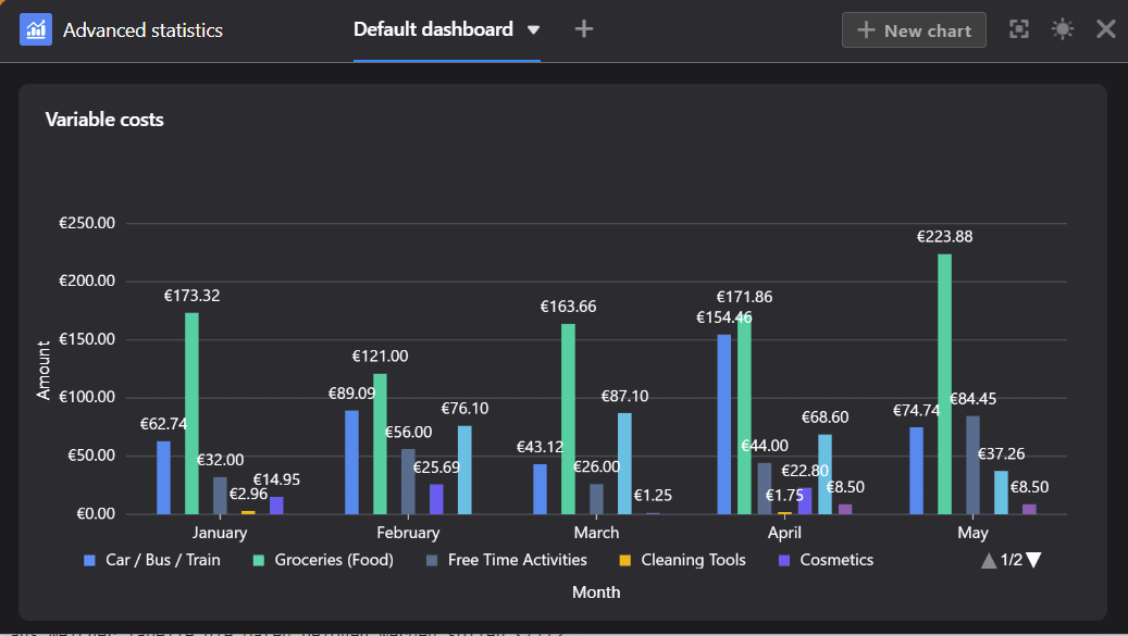
Mit dem Statistik-Modul können Sie die Daten aus Ihrer Tabelle visuell in Form von verschiedenen Grafiken und Diagrammen darstellen. Dies ist für Ihre Arbeit in SeaTable äußerst nützlich: Dank der Dashboards behalten Sie immer den Überblick über die Zahlen und statistischen Entwicklungen in Ihrer Base.
Das Statistik-Modul öffnen
Das Statistik-Modul ist standardmäßig in jeder Base eingerichtet. Sie erreichen es stets über die Schaltfläche “Statistiken” im Base-Header.

Eine Grafik erstellen
- Öffnen Sie das Statistik-Modul und klicken Sie rechts oben auf die Schaltfläche Neue Grafik, um eine neue Grafik hinzuzufügen.
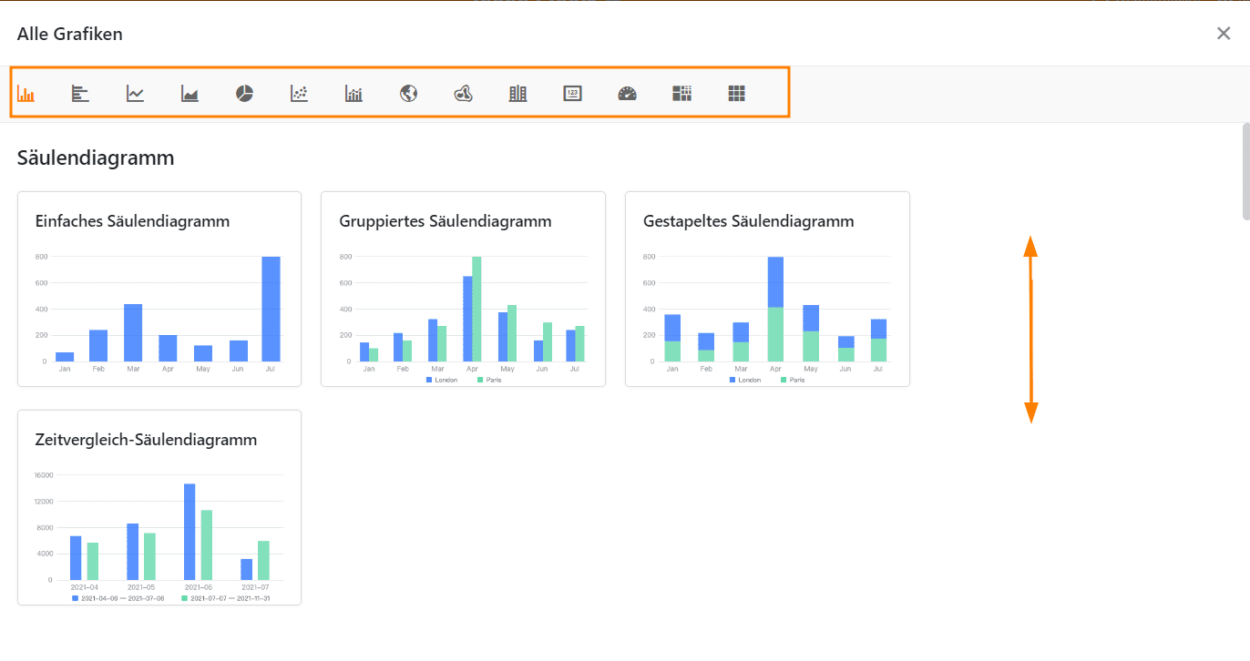
- Wählen Sie den passenden Typ für Ihre Statistik aus.
- Geben Sie der Grafik einen Titel. Klicken Sie dazu auf das Stift-Symbol und tragen Sie den gewünschten Namen ein.
- Legen Sie fest, aus welcher Tabelle und Ansicht die Statistik die Daten beziehen soll.
- Je nach Grafik können Sie unterschiedliche Dateneinstellungen vornehmen – bei einem Säulendiagramm zum Beispiel, welche Werte Sie auf der X- und Y-Achse darstellen möchten.
- Wenn die von Ihnen gewählte Grafik Stileinstellungen erlaubt, können Sie beispielsweise Farben oder Datenbeschriftungen konfigurieren.
- Nachdem Sie das Einstellungsfenster geschlossen haben, erscheint die gespeicherte Grafik auf Ihrem Dashboard.
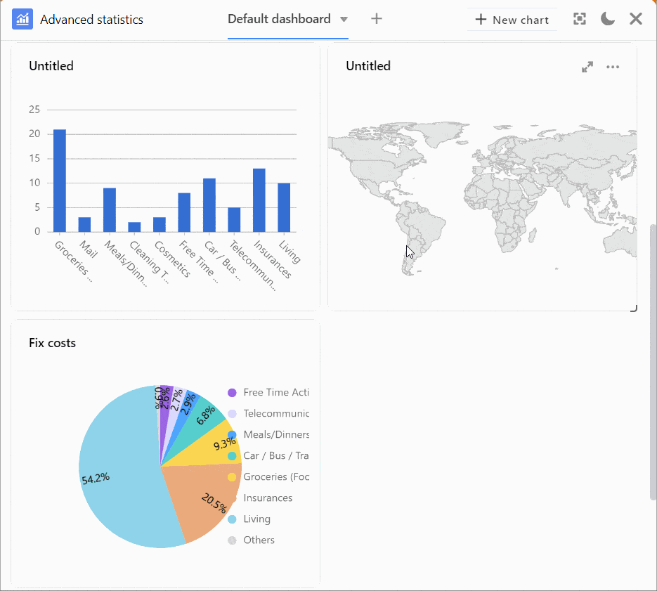
Sie haben die Möglichkeit, aus verschiedenen Typen von Grafiken und Diagrammen auszuwählen. Scrollen Sie durch die Auswahl oder klicken Sie in der Optionsleiste auf die beschrifteten Icons, um direkt an die gewünschte Stelle zu springen.
Dateneinstellungen
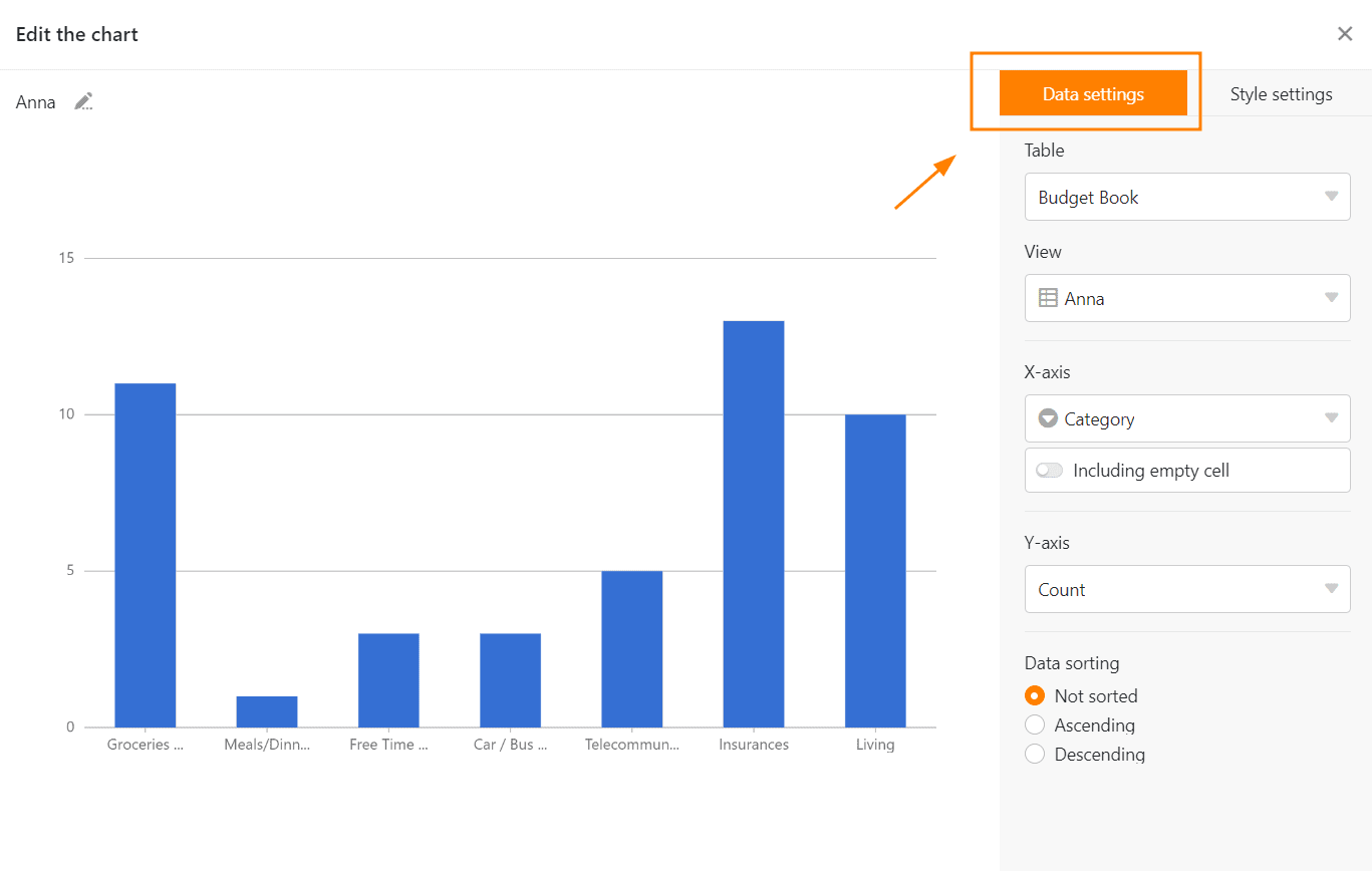
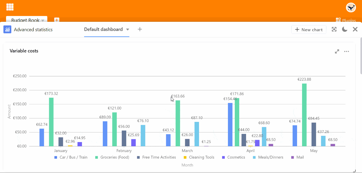
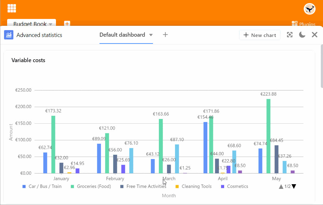
Sie beginnen die Detailarbeit an einem Säulendiagramm mit der Auswahl der Spalte, welche die Werte für die X-Achse liefern soll. Klicken Sie auf das entsprechende Drop-down-Feld und wählen Sie die Spalte aus. Mit einem Regler können Sie einstellen, ob Sie leere Zeilen im Diagramm berücksichtigen wollen.
Wählen Sie dann, wie die Werte auf der Y-Achse dargestellt werden sollen. Sie können wählen zwischen der Anzahl der Einträge, die einen bestimmten Wert in der gewählten Spalte aufweisen, und der Option Feld zusammenfassen, bei der Sie in numerischen Spalten entweder die Summe, den Durchschnitt, die Anzahl eindeutiger Werte, das Maximum oder das Minimum auswerten können. Bei gruppierten oder gestapelten Diagrammen können Sie eine Spalte mit Optionen angeben, nach denen Sie gruppieren möchten.
Alle Einstellungsänderungen werden in Echtzeit ausgeführt, d.h. das Diagramm wird bei jeder Einstellungsänderung unmittelbar aktualisiert. So können Sie direkt sehen, ob Sie das gewünschte Ergebnis erzielt haben oder nachjustieren müssen.
Stileinstellungen

Grafiken auf dem Dashboard
Sie können mehrere Dashboards anlegen und auf jedem Dashboard beliebig viele Grafiken erstellen. Um die Reihenfolge der Grafiken zu ändern, ziehen Sie diese per Drag-and-Drop an die gewünschte Stelle. Fahren Sie dazu mit dem Mauszeiger über den Titel einer Grafik, bis ein Pfeilkreuz angezeigt wird, und halten Sie die Maustaste gedrückt.
Optionen für eine Grafik
Wenn Sie mit dem Mauszeiger über eine Grafik fahren, erscheinen in der rechten oberen Ecke ein Doppelpfeil-Symbol und ein Drei-Punkte-Symbol . Wählen Sie den Doppelpfeil aus, um eine Grafik im Vollbildmodus anzuzeigen. Auf alle anderen Optionen können Sie über die drei Punkte zugreifen:
- Grafik bearbeiten
- Grafik kopieren
- Als Bild exportieren
- Grafik löschen
Weitere Anzeige-Optionen
Per Klick auf können Sie sich das gesamte Fenster des Statistik-Moduls im Vollbildmodus anzeigen lassen.
Über die Symbole und können Sie zwischen hellem und dunklem Modus wechseln.