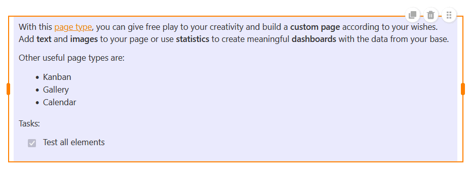
Mit diesem Seitentyp können Sie Ihrer Kreativität freien Lauf lassen und eine individuelle Seite ganz nach Ihren Wünschen bauen. Fügen Sie Texte und Bilder in Ihre Seite ein oder nutzen Sie Statistiken, um mit den Daten aus Ihrer Base aussagekräftige Dashboards zu erstellen.
Individuelle Seiten erstellen
Wenn Sie die Einstellungen einer Seite ändern möchten, klicken Sie in der Navigation auf das entsprechende Zahnrad-Symbol.
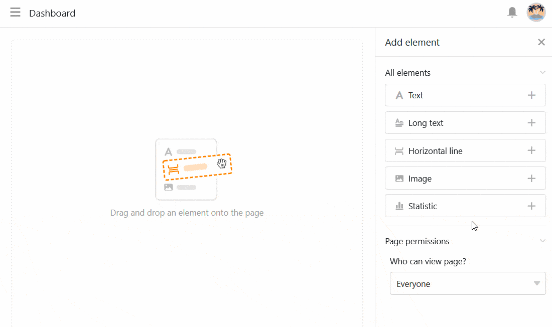
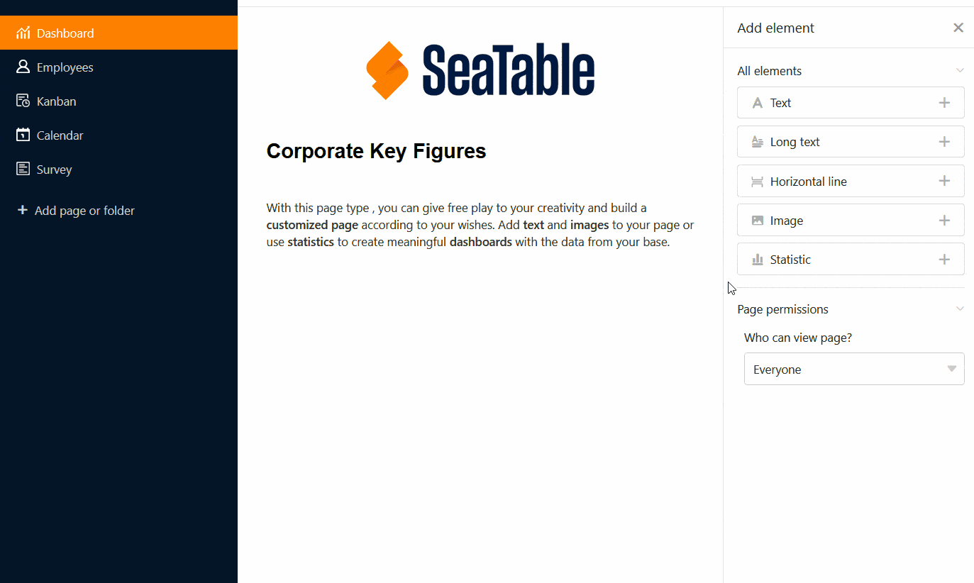
Über die Seiteneinstellungen können Sie verschiedene Elemente per Drag-and-Drop zu Ihrer Seite hinzufügen.
Elemente kopieren, verschieben oder löschen
Wenn Sie ein bestehendes Element auf Ihrer individuellen Seite kopieren, verschieben oder löschen möchten, nutzen Sie einfach die drei entsprechenden Symbole an der oberen rechten Ecke des Rahmens.

Elementeinstellungen
Für jedes Element der individuellen Seite gibt es zusätzliche Einstellungen, die hauptsächlich die Formatierung und die grafische Konfiguration betreffen.
Text
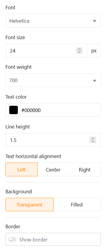
Text-Elemente eignen sich vor allem für Überschriften oder kurze Texte, die Sie auf Ihrer individuellen Seite platzieren wollen.

In den Elementeinstellungen können Sie zahlreiche Parameter festlegen:
- Schriftart, -größe, -stärke und -farbe
- Zeilenabstand und Textausrichtung
- Hintergrund und Rahmen
Formatierter Text
Mit formatierten Text-Elementen können Sie, wie der Name schon sagt, längere Texte formatieren. Dabei öffnet sich der Texteditor, den Sie bereits vom Spaltentyp Formatierter Text kennen.
Da Sie im Texteditor bereits vielfältige Formatierungsoptionen haben, können Sie in den Elementeinstellungen nur noch die Hintergrundfarbe und den Rahmen der Textbox einstellen.
Horizontale Linie
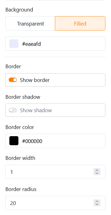
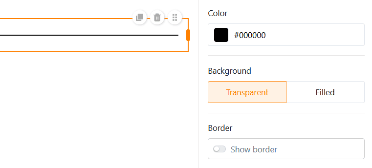
Um auf Ihrer individuellen Seite verschiedene Bereiche voneinander abzutrennen, können Sie eine horizontale Linie einziehen. Dabei können Sie eine Farbe, einen Hintergrund und einen Rahmen festlegen.
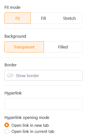
Bilder
Um Ihre individuelle Seite schöner zu gestalten, können Sie ganz leicht Bilder hinzufügen. Klicken Sie dazu auf den Bilderrahmen, den Sie zuvor per Drag-and-Drop in die Seite eingebettet haben, und laden Sie das gewünschte Bild von Ihrem Gerät hoch.
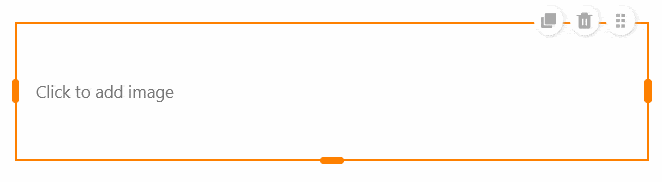
In den Elementeinstellungen können Sie den Füllmodus, den Hintergrund und den Rahmen des Bildes festlegen. Darüber hinaus können Sie Hyperlinks nutzen, um andere Seiten der App oder externe Ressourcen auf einem Bild zu verlinken.
Container
Ein Container gibt ein Raster vor, mit dem Sie andere Elemente (z. B. Texte, Bilder, Statistiken) leichter anordnen und in Gruppen zusammenfassen können. Zuallererst legen Sie daher fest, wie viele Zeilen und Spalten dieses Raster haben soll. Daraus ergeben sich die einzelnen Boxen, in die Sie per Drag-and-Drop andere Elemente einfügen können.
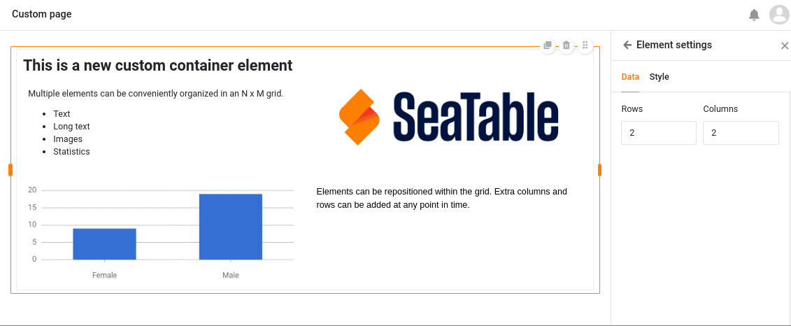
In den Elementeinstellungen können Sie dem Container einen Titel hinzufügen, dessen Schriftgröße, Schriftstärke und Ausrichtung Sie anpassen können. Zudem haben Sie die Möglichkeit, die Hintergrundfarbe und den Rahmen des Containers einzustellen.
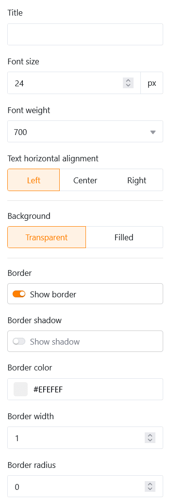
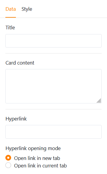
Karte (Design-Vorlage)
Für ein schönes Seitenlayout sorgt auch die Karte, die ein Bild, eine Überschrift und einen Text zu einer Design-Vorlage vereint.
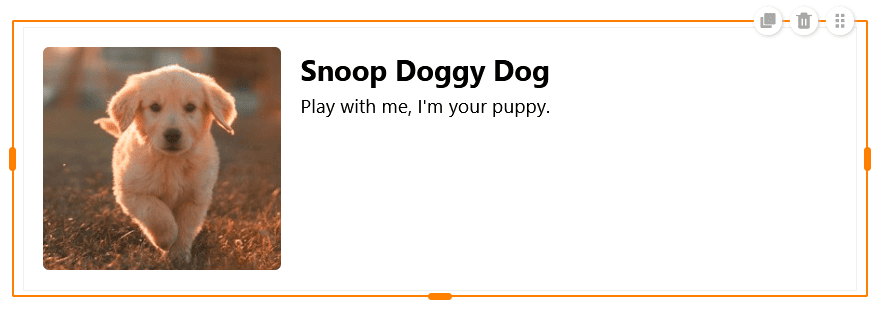
In diese Vorlage können Sie ein Bild, einen Titel und einen Karteninhalt (Text) einfügen. Darüber hinaus können Sie einen Hyperlink nutzen, um eine andere Seite der App oder eine externe Ressource zu verlinken.
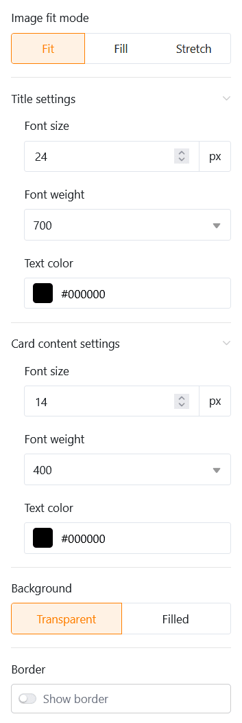
Was die Gestaltung der Karte angeht, haben Sie zuerst die Möglichkeit, den Füllmodus des Bildes zu ändern. Als Nächstes können Sie die Schriftgröße, -stärke und -farbe sowohl des Titels als auch des Karteninhalts anpassen. Zuletzt stellen Sie die Hintergrundfarbe und den Rahmen der Karte ein.
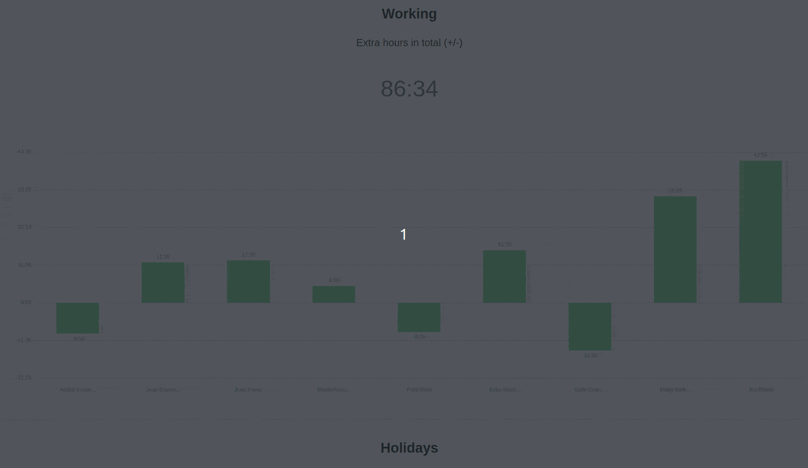
Statistiken
Auf einer individuellen Seite Ihrer App können Sie die Daten aus der zugrundeliegenden Base mithilfe verschiedenster Grafiken und Diagramme veranschaulichen.
Dateneinstellungen
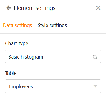
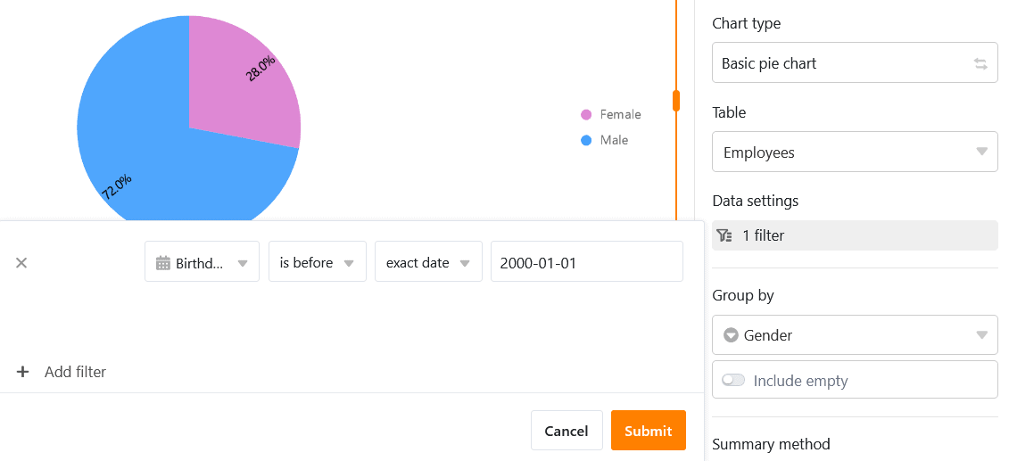
Die Konfiguration von Statistiken weist dabei viele Ähnlichkeiten zum Statistik-Modul in der Base auf. Wählen Sie zunächst die Tabelle, aus der die Statistik Daten darstellen soll. Mit einem Klick auf die entgegengesetzten Pfeile können Sie den Diagrammtyp ändern.
Sie können die Einträge filtern, um die in der Statistik angezeigten Daten einzugrenzen. Klicken Sie dazu auf Filter hinzufügen, wählen Sie die gewünschte Spalte und Bedingung und bestätigen Sie mit Abschicken.
Bei einem Säulendiagramm müssen Sie die Spalte festlegen, welche die Werte für die X-Achse liefern soll. Klicken Sie auf das entsprechende Drop-down-Feld und wählen Sie die Spalte aus. Mit einem Regler können Sie einstellen, ob Sie leere Zeilen im Diagramm berücksichtigen wollen.
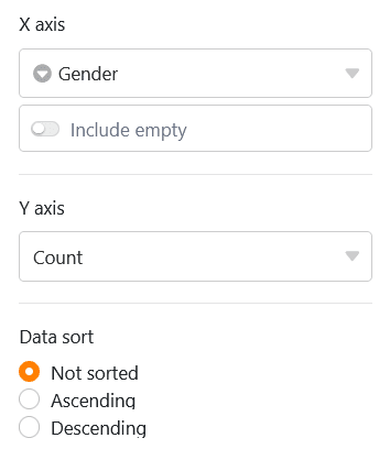
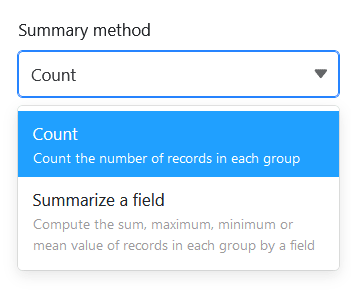
Entscheiden Sie dann, wie die Werte auf der Y-Achse dargestellt werden sollen. Sie können wählen zwischen der Anzahl der Einträge, die einen bestimmten Wert in der gewählten Spalte aufweisen, und der Option Feld zusammenfassen, bei der Sie in numerischen Spalten entweder die Summe, den Durchschnitt, die Anzahl eindeutiger Werte, das Maximum oder das Minimum auswerten können.
Bei gruppierten Diagrammen können Sie eine Spalte mit Optionen angeben, nach denen Sie gruppieren möchten. Bei einigen Diagrammtypen können Sie die Daten auch aufsteigend oder absteigend sortieren.
Stileinstellungen
Je nach Diagrammtyp haben Sie unterschiedliche Stileinstellungen zur Auswahl.
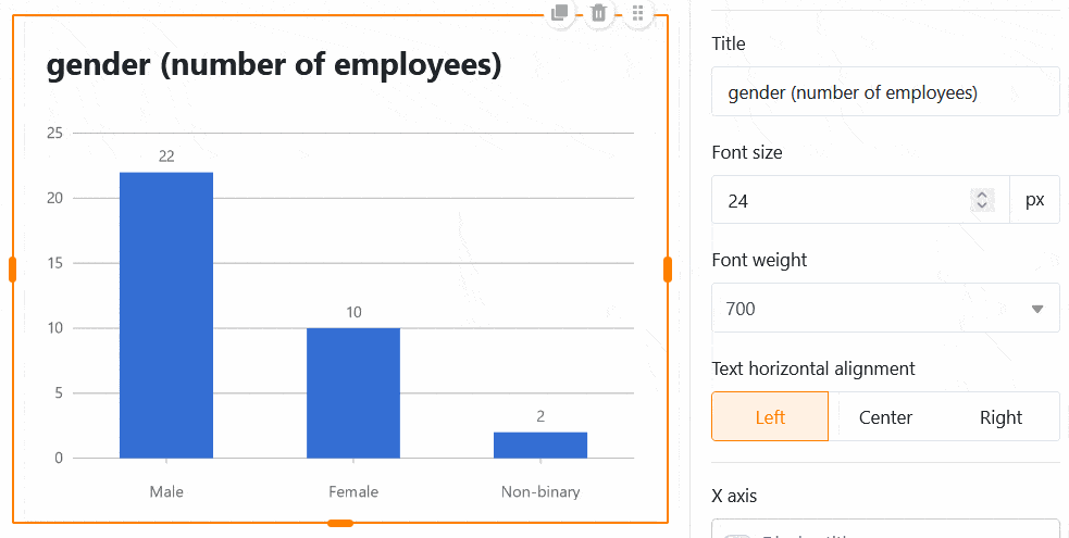
Für ein Säulendiagramm können Sie beispielsweise die folgenden Einstellungen vornehmen:
- Titel, Schriftgröße, Schriftstärke und Ausrichtung
- Titel der X- und Y-Achse anzeigen
- Automatische Grenzen oder Minimum und Maximum der Y-Achse
- Farbe und Datenbeschriftung der Säulen
- Rahmen (Schatten, Farbe, Dicke und Radius)
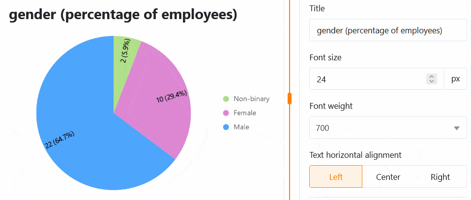
Für ein Kuchendiagramm können Sie die folgenden Einstellungen vornehmen:
- Titel, Schriftgröße, Schriftstärke und Ausrichtung
- Legende und Beschriftung anzeigen
- Position, Format und Schriftgröße der Labels
- Mindestanteil eines Sektors
- Rahmen (Schatten, Farbe, Dicke und Radius)
Alle Einstellungsänderungen werden in Echtzeit ausgeführt, d.h. das Diagramm wird bei jeder Einstellungsänderung unmittelbar aktualisiert. So können Sie direkt sehen, ob Sie das gewünschte Ergebnis erzielt haben oder nachjustieren müssen.
Hintergrundfarbe der Seite einstellen
Über die Farben der einzelnen Seitenelemente hinaus können Sie auch die Hintergrundfarbe einer gesamten individuellen Seite einstellen.
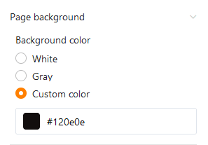
Wählen Sie zwischen Weiß, Grau und einer eigenen Farbe, die Sie per Hexadezimalcode eingeben oder im Farbwähler frei bestimmen können.
Titelleiste ausblenden
Falls Sie auf einer individuellen Seite die Titelleiste ausblenden möchten, können Sie dies tun, indem Sie den entsprechenden Regler aktivieren.
Seitenberechtigungen
Zu guter Letzt können Sie in den Seiteneinstellungen eingrenzen, wer die Seite sehen darf.
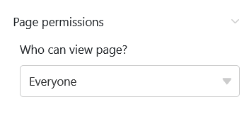
Das ist die einzige Seitenberechtigung, die Sie bei individuellen Seiten zur Auswahl haben – denn über individuelle Seiten können keine Zeilen in der Tabelle hinzugefügt, verändert oder gelöscht werden.
